This post contains affiliate links. If you grab one of the printables I recommend, I may earn a small commission at no extra cost to you.
The hallway by the stairs has been beige since we moved in. Four years. This September I finally taped up a mock gallery wall with painter’s tape and stood there squinting at blue rectangles until my partner asked if I was okay.
Here is what I learned by doing it wrong first: a Halloween wall is not a pile of prints, it is three jobs. One big anchor piece that reads from the front door. A run of quiet minimalist pieces that let the anchor breathe. And two or three loud vintage or folk accents so the whole thing does not look like a furniture catalog in costume. You mix the styles on purpose, not by accident.
Every file below slots into one of those jobs. I printed most of them myself, framed them in old frames from the consignment shop on Route 9, and yes, some of the links are affiliate links, so if you grab one I get a small cut. Costs you nothing. Go find your level.
Start With a Spine: One Bundle, Two Anchors
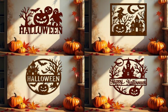
The bundle is the spine of the whole wall. It holds a handful of layered designs, and the trick is to pick two, maybe three, and let them own the top of the stairs where everyone actually looks. My neighbor ran two of them through her laser in dark wood and I owe her a pie.
The third one I printed as a plain black silhouette on 110 lb cardstock and cut out by hand during a long movie. Slower. Still worked.
One warning: do not use the whole bundle. I laid every design out on the hall floor once and it looked like a flea market table, not a wall. Two anchors. Stop there.
The One Big Silhouette That Reads From the Front Door
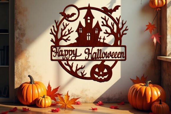
Every gallery wall needs one piece you can name from the doormat, before anyone even reaches the stairs. This is mine. It is a single bold design, and bold is the point, because at hallway distance fine detail turns to mush anyway.
I sized it to 16×20, had the print shop run it, then dropped it into the biggest consignment frame I own, a chipped gold thing that cost three dollars. The chips help, honestly.
Nitpick: the interior cutouts are delicate, so if you print small the openings close up visually. Keep it 11×14 or larger. Below that it reads as a smudge.
Its Quieter Cousin, One Step Down
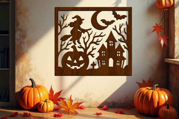
Same family as the big one, calmer mood, and that is exactly why it earns a spot. A wall of nothing but showstoppers is exhausting to walk past. This one steps the eye down, one frame lower, half the size.
I hung it a full stair-width away from its cousin so the two read as a set instead of a stutter. That gap matters. Side by side they cancel each other out, and I know because I tried it first and my sister said the hallway looked like a spot-the-difference puzzle.
A Crooked Tree for the Tall Skinny Gap
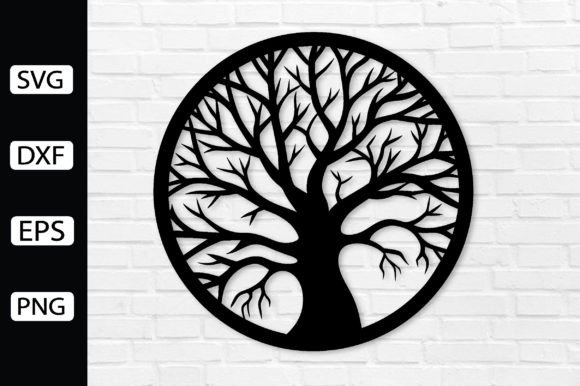
There is always one tall thin sliver of wall by the stairs that nothing fits. The crooked tree fits. Vertical, spindly, a little mean looking, like it was drawn for exactly that gap.
I printed it as a straight black silhouette at 11×17 on the library printer and hung it frameless, just careful painter’s tape loops on the back, because a frame would choke the branches.
Do not try to hand-cut this one. I got four branches deep with a craft knife on September 14th and quit. Keep it a printed silhouette, or hand the file to someone with a laser and stand back.
Folk Brushstrokes to Warm Up All That Black
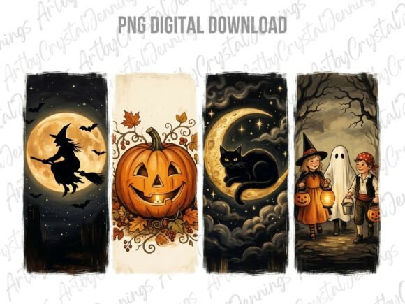
By the time I had three black silhouettes up, the wall went cold. Cemetery cold. This folk brushstroke set is the warm layer, pumpkin orange and cream strokes that look hand-painted because at some point they were.
The files are PNG, so they print straight from the home printer. Mine went into a beat-up gold frame from the consignment shop, and folk art plus old gilt reads like something you inherited from a great-aunt with opinions.
One catch: on the default print setting the oranges came out muddy. Switch the paper type to matte cardstock in the printer menu and the color wakes up. I learned that three wasted sheets in.
Chalkboard Charm in the Smallest Frames
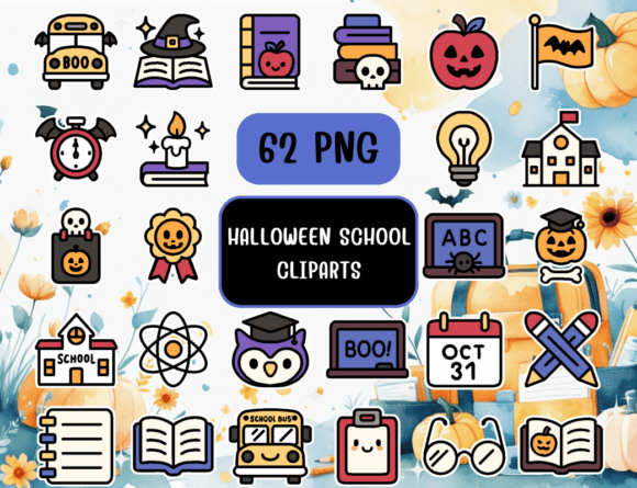
Consignment shops are drowning in tiny 4×6 frames nobody wants. Fifty cents, sometimes a quarter. This chalkboard-style school set is what I feed them: a small pumpkin, a bat, a stack of books with a spider on top, each element cropped and printed on its own.
A row of five tiny frames following the stair rail line gives the wall rhythm between the big pieces. Small, repeated, slightly silly.
The catch is that it is clip art, so lots of elements share each sheet and you crop every single one yourself. That ate a full evening and two cups of cider. Budget for it.
Thin Black Lines for the Minimalist Stretch
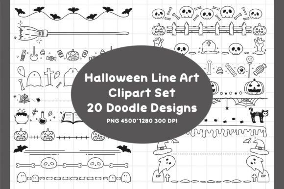
The stretch between my two anchors is where the minimalist layer lives. Three line drawings from this set, printed 8×10, in matching thin black frames, spaced evenly. This is the one row where I used the bubble level on every single frame, because sloppy spacing kills minimalism dead.
Nitpick: the lines are genuinely thin. At 5×7 they nearly vanished from across the hall. Print 8×10 minimum, and if your printer runs light, nudge the ink density up one notch before you commit good cardstock.
When You Run Out of Real Frames, Print the Frames
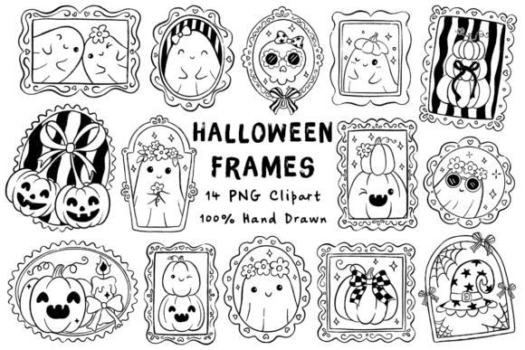
Halfway through October I ran out of real frames. This doodle frame bundle is the cheat: printed borders that act like frames, so the art hangs bare with painter’s tape loops on the back and still looks finished.
I put a short Poe line inside one border and a little line-art cat inside another, then taped them into the gaps my layout left. Nobody has noticed they are paper. I check.
Some of the doodle borders are busy, though. Busy frame plus busy center is chaos, so pair the wild ones with something plain in the middle.
Vintage Paper That Does the Matting for You
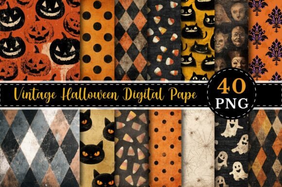
The vintage design paper is my mat trick. Cut a sheet down, sit a smaller print on top, and the frame suddenly has that crepe-paper, old-parlor feel without any actual antiques.
A full sheet framed as-is also holds its own. I hung one next to the light switch and it is the thing guests touch on their way up, which I have decided to take as a compliment.
Fair warning: these sheets are edge-to-edge ink. I printed four on October 3rd last year and the orange cartridge died halfway through the fifth. Print these last, after everything else you need is already done.
A Country Detour at the Bottom Step
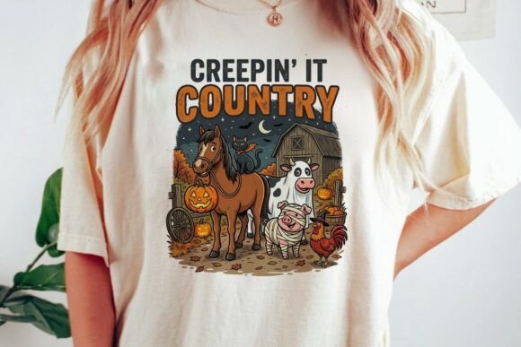
Every wall needs one piece that breaks its own rules, or the whole thing feels like a showroom. Mine is this country farm set: a cow in a witch hat has no business hanging near gothic silhouettes, and that is exactly why it works.
It lives at the very bottom of the stairs by the coat hooks, far from the moody stuff, and it collects more comments than either anchor. My partner says hello to the cow. Out loud.
Placement is the whole game here. Mid-wall, it fights the gothic pieces and loses. Far end, it is the punchline.
Frequently Asked Questions
Can you wear a halloween mask in public?
Mostly yes, especially in the run-up to Halloween, but a few towns still have old anti-mask rules on the books, and places like banks or gas stations can ask you to take it off no matter the date. Nobody blinked when I walked to the consignment shop in a witch hat and half a cape.
A full face mask is a different animal than a hat or face paint, so if you are unsure, check your town’s rules and keep the mask in your bag until you reach the party.
What is vintage halloween?
It is the look from roughly the 1920s through the 1960s: crepe paper orange and black, grinning paper moons, die-cut black cats with hinged arms, and that slightly off-register printing that makes everything feel inherited. The design paper in this list leans exactly that way.
Quick field test: if the pumpkin looks a little unhinged and the palette is orange, black, and a strange faded cream, you are looking at vintage Halloween.
Can I print these at home?
The PNG and JPG art, yes, straight off a home printer on decent cardstock, 65 lb at minimum if you want it to hang flat. The laser cut SVGs are a different job: those files feed a cutting machine, so at home you either print the preview as a flat silhouette, like I did, or borrow a friend who owns a laser.
My tired inkjet handled everything else on this list. The library printer handled the oversized pieces for about forty cents a page.
What file formats do these designs come in?
The laser pieces come as SVG, sometimes with DXF riding along for different machines. The printable art is mostly PNG or JPG at 300 dpi, and a few sellers toss in a PDF already sized to common frames.
One thing worth checking before you buy: whether the PNG has a transparent background. It matters the second you want to layer a design over the vintage paper instead of framing it on plain white.
Before You Print
Tape the layout first. Blue painter’s tape rectangles, live with them for two days, shuffle them every time you pass on the stairs. It is much cheaper to argue with tape than with nail holes, and the bubble level only comes out once the tape stops moving.
My hallway took two weekends, eleven dollars in consignment frames, and one orange cartridge. The crooked tree is still up from last year. My partner has not mentioned it yet, and I am not going to be the one who brings it up.